HappySignals | Survey Experience | Senior Product Designer
Making employee feedback faster, clearer and easier to complete
Challenge
The HappySignals survey experience contained outdated interactions, limited customization, and accessibility issues that created unnecessary friction. It also needed to collect richer employee context without making surveys feel longer, more complicated, or more difficult to complete.
My contribution
I reviewed the existing experience, customer and employee feedback, and product usage data to identify the main sources of friction. I designed a clearer interaction model, reusable survey patterns, customization capabilities, and an optional Employee Data step alongside product and engineering.
Result
Released in 2025, the redesigned survey created a clearer and more consistent experience, gave customers greater control over customization, and enabled richer contextual insights. By making surveys faster and easier to complete, the redesign contributed to a 30% increase in response rate.
Research: Where was the friction?
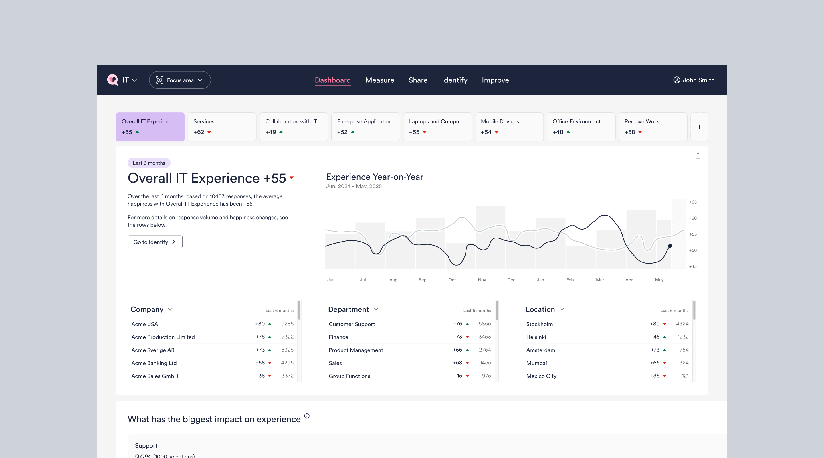
HappySignals helps companies understand how employees experience their workplace technology.
Surveys are a fundamental part of the product: nearly all of the experience data available to customers begins with an employee choosing to give feedback.
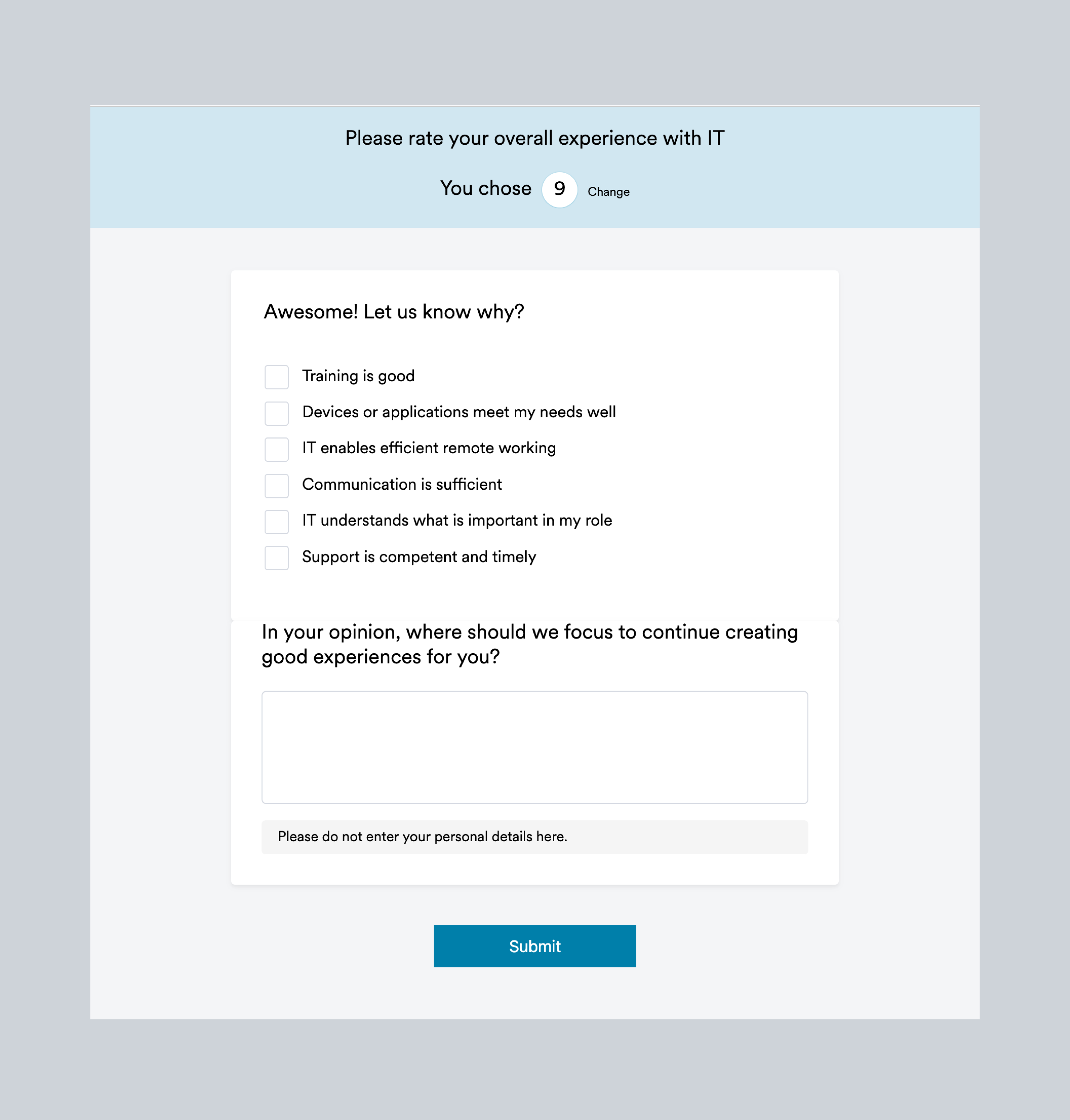
The existing survey experience was no longer meeting the needs of users or customers. The UI felt outdated, customization options were limited, some interactions lacked clarity, and accessibility issues created unnecessary friction. Together, these problems were contributing to lower response rates and reducing the quality of the feedback collected.
The project began with a review of the existing survey experience, customer and employee feedback, and product data showing how people interacted with surveys.
Three main opportunities emerged:
- Reduce friction. Make surveys faster, clearer, and easier to complete across devices.
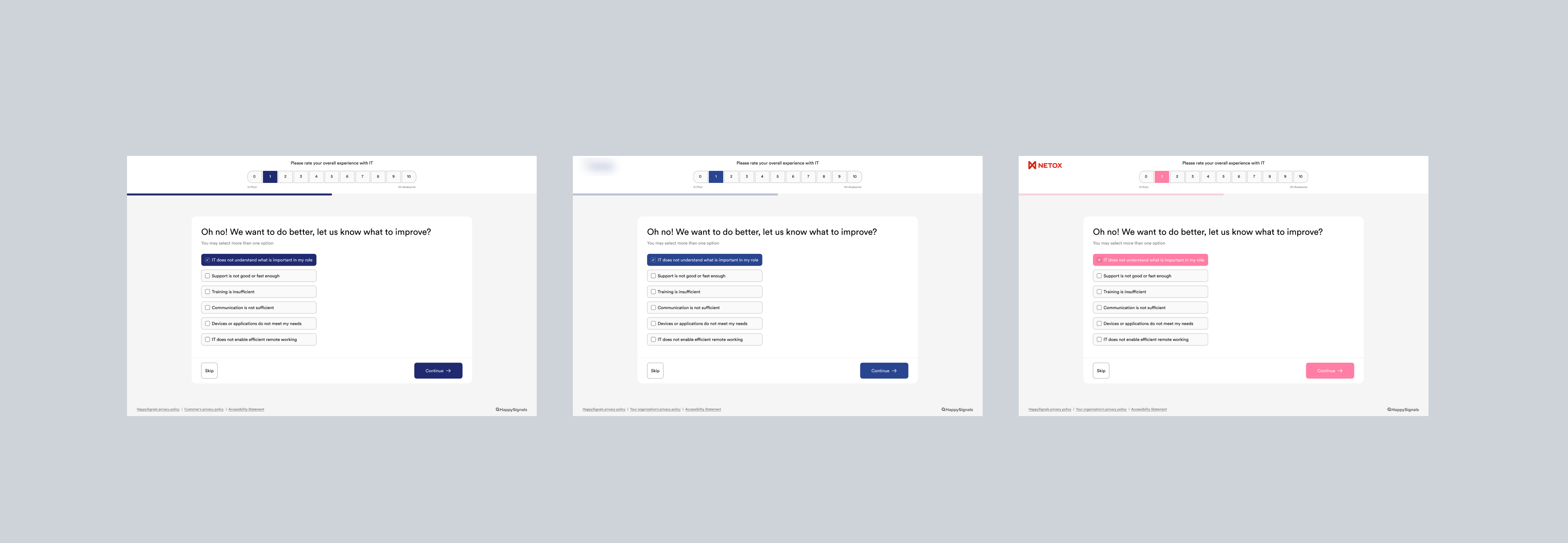
- Create a consistent experience. Build a recognizable and cohesive survey experience regardless of how or where the survey was delivered.
- Design for scale. Treat the survey redesign as the foundation for a broader employee experience, including customizable branding, new survey formats, an employee hub, and future ways for organizations to engage with employees.
Ideation: How could we ask for more while making the experience feel lighter?
One of the key principles throughout the project was that improving the amount or quality of data should not come at the expense of the employee experience.
The survey often reaches employees while they are doing something else. They may open it from an email or directly inside Microsoft Teams and spend only a short amount of time deciding whether to respond.
That made seemingly small details important.
We explored improvements around:
- Question hierarchy: Making it immediately clear what the employee was being asked.
- Response interactions: Making answer options easier to scan, select and understand.
- Visual consistency: Bringing different survey types and delivery channels under the same experience.
- Progressive data collection: Keeping the core feedback flow focused and placing additional questions at the appropriate point in the journey.
Rather than redesigning individual screens independently, I approached the survey as a reusable system that could accommodate different measurement areas and future question types.
Refine: Creating a simpler and more scalable survey
As the direction became clearer, I worked closely with product and engineering to refine the interaction patterns and align them with our design system.
The new experience introduced a clearer hierarchy and more consistent interaction model across surveys.
The easier to understand while also improving the usefulness of the data produced.
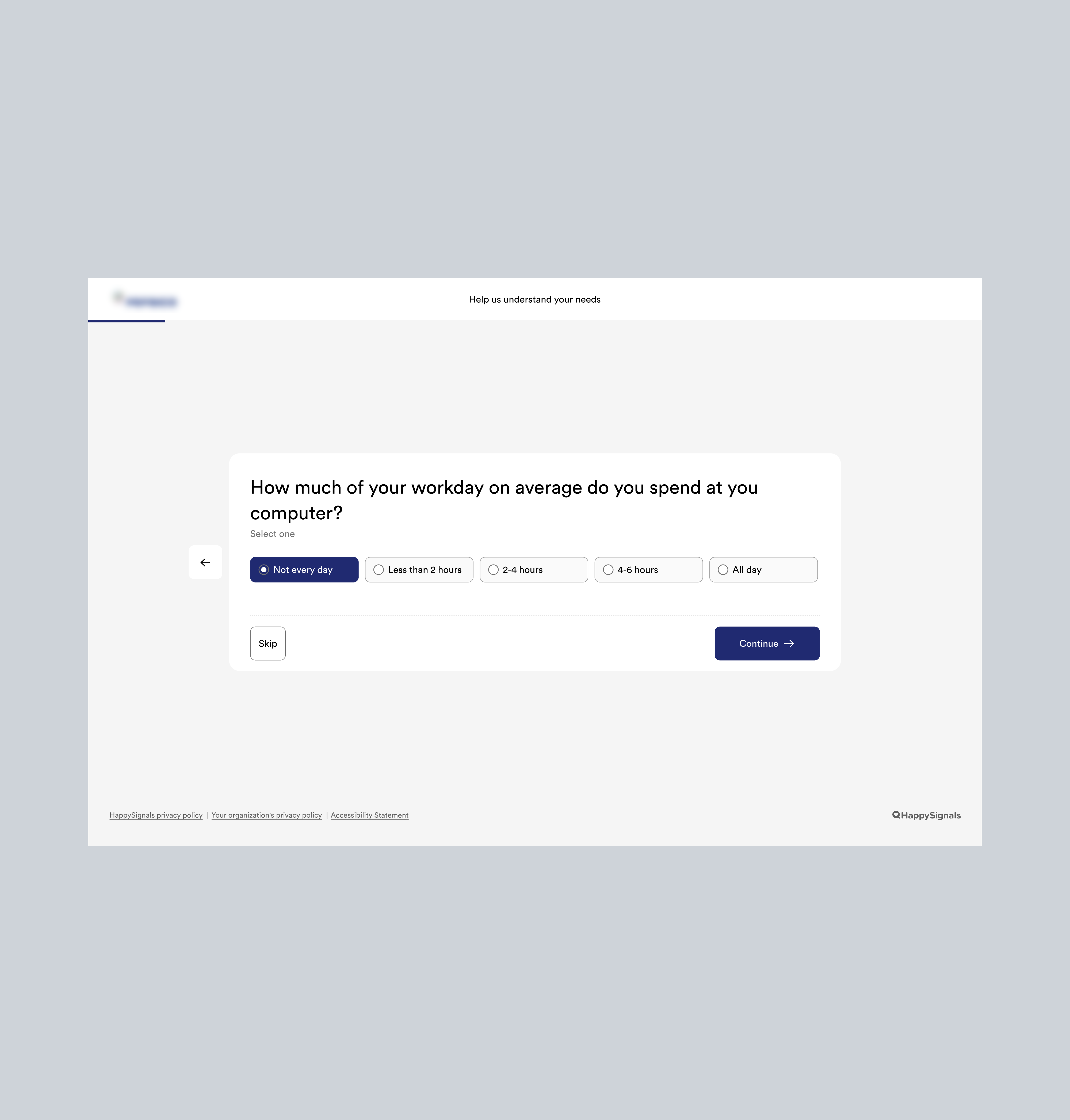
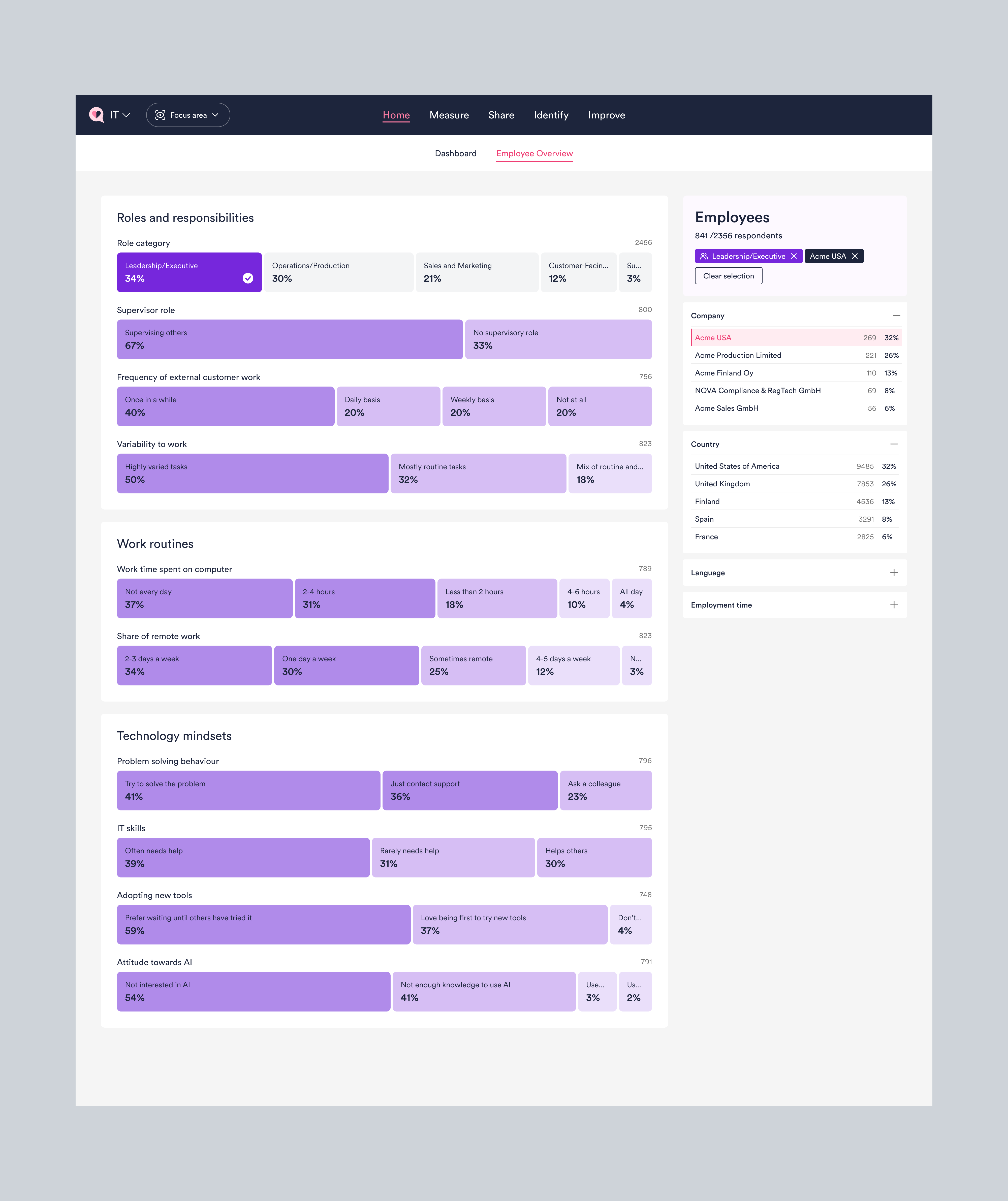
Introducing Employee Data
Another important part of the project was introducing Employee Data.
Until then, customers could understand what employees were experiencing, but had limited context about the people behind that feedback.
We wanted customers to be able to identify patterns based on factors such as:
- Remote, hybrid or office-based work
- Team leadership
- AI usage
- Role and responsibility
The challenge was adding this information without making the primary survey feel significantly longer.
Instead of mixing these questions into the main feedback flow, Employee Data was designed as a separate set of questions shown after the survey.
This allowed the primary interaction to remain focused while giving employees the option to provide additional context.
The information remained anonymous and could be connected to previous feedback, making it possible to understand longer-term patterns between different employee groups.
Outcome and learnings
The redesigned survey was released in 2025 and became the new foundation for employee feedback across HappySignals.
The new experience made surveys faster and easier to complete, created consistency between email and Microsoft Teams, and enabled richer contextual information through Employee Data. HappySignals positioned the release around higher-quality data, improved response rates and more context-rich insights.
Most importantly, the redesign contributed to a 30% increase in survey response rate, providing a measurable indication that reducing friction in the experience had a direct effect on participation.
Key Learnings:
- Small interactions can have a large impact: In a short survey experience, hierarchy, wording and interaction details directly influence whether people complete it.
- Better data starts with better UX: Asking more questions is not necessarily the best way to improve insight. Reducing friction can improve both participation and data quality.
- Design for the system, not the screen: Creating reusable survey patterns made it easier to support new measurement areas and capabilities without fragmenting the experience.
- Balance user and business needs: The strongest solution allowed HappySignals to collect richer information while keeping the employee experience lightweight.