HappySignals | Dashboard Renewal | Senior Product Designer
Turning complex experience data into clear insights and actionable decisions
Challenge
Decision-driving data was spread across multiple metrics and views, making it difficult for leaders to understand overall performance, recognize what needed attention, and decide where to investigate next. The dashboard also needed to be understandable without extensive product training.
My contribution
I worked closely with the leadership team to identify and prioritize the dashboard’s essential information. I then designed, prototyped, and handed over a clearer information hierarchy connecting performance trends, targets, Experience Drivers, AI-generated Focus Topics, and employee-group analysis.
Result
The renewed dashboard gives leaders a focused overview for identifying problems, discussing performance, and deciding where to concentrate improvement efforts. Time spent on the dashboard grew 4x compared with the previous version, and the redesign rolled out to all customers without major friction.
Research: What are our problems?
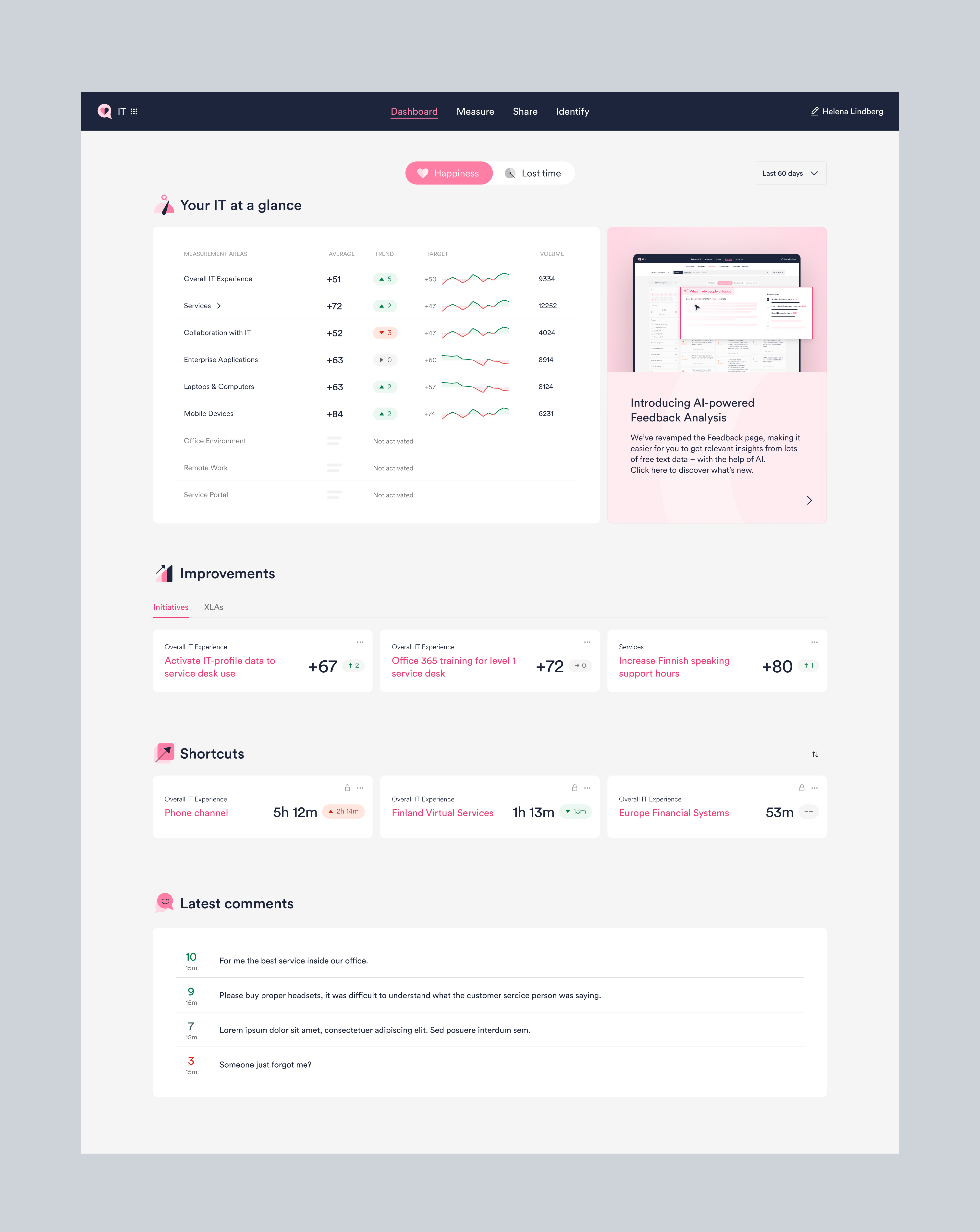
The existing dashboard provided access to valuable experience data, but understanding the overall situation required users to interpret multiple metrics and navigate between different views.
Through customer feedback, product insights, and analysis of the existing experience, we identified an opportunity to shift the dashboard from presenting data to guiding attention.
The challenge wasn't to show more information. It was to create a clearer hierarchy that helped users answer three questions:
1. How are we doing?
Understand the current state and how experience is evolving.
2. What needs my attention?
Surface meaningful changes, employee feedback, and areas for improvement.
3. Where should I investigate next?
Create direct paths from high-level signals into deeper analysis.
Overview first, analysis second
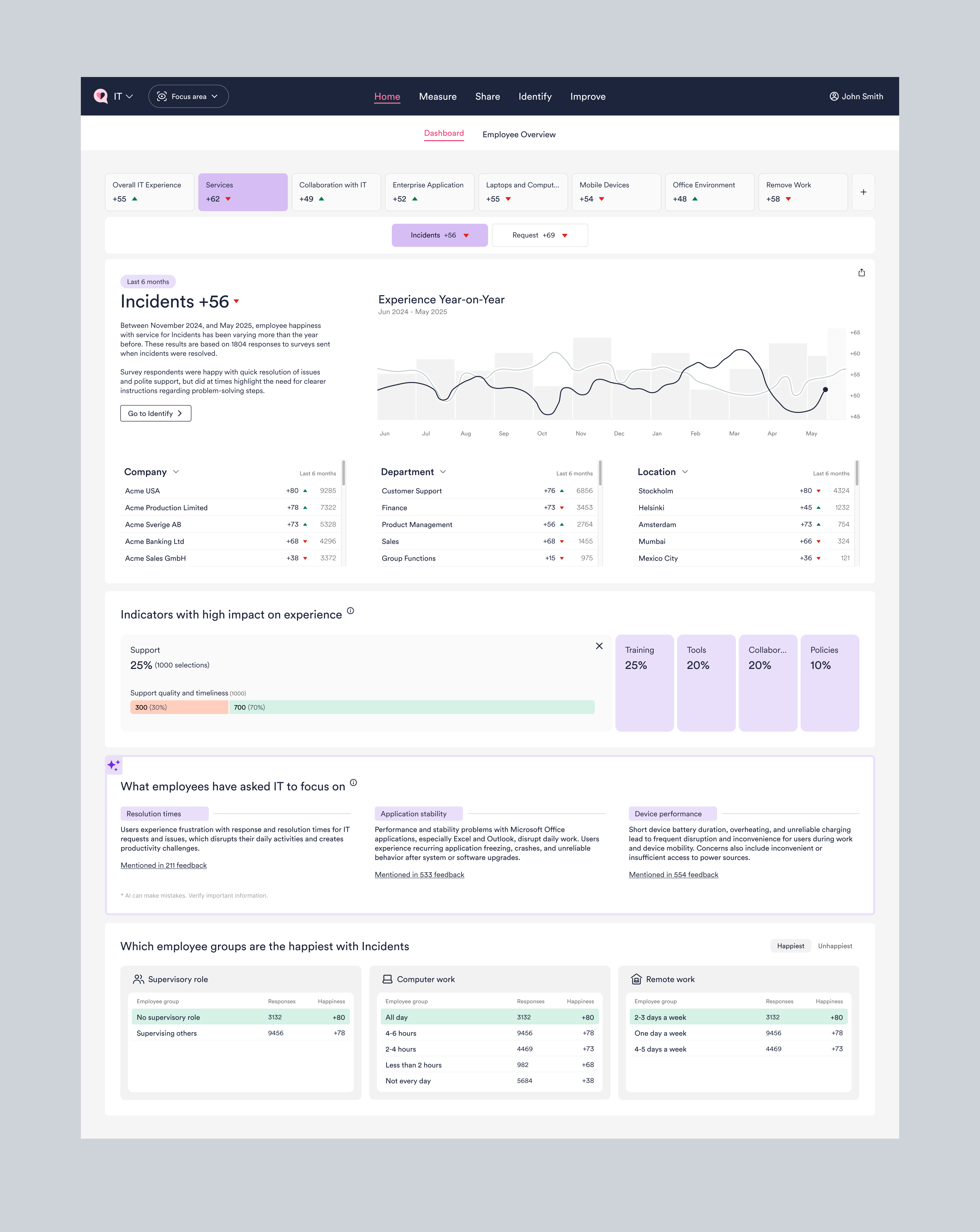
The dashboard was redesigned around a simple principle: users shouldn't need to analyze everything to understand where they stand.
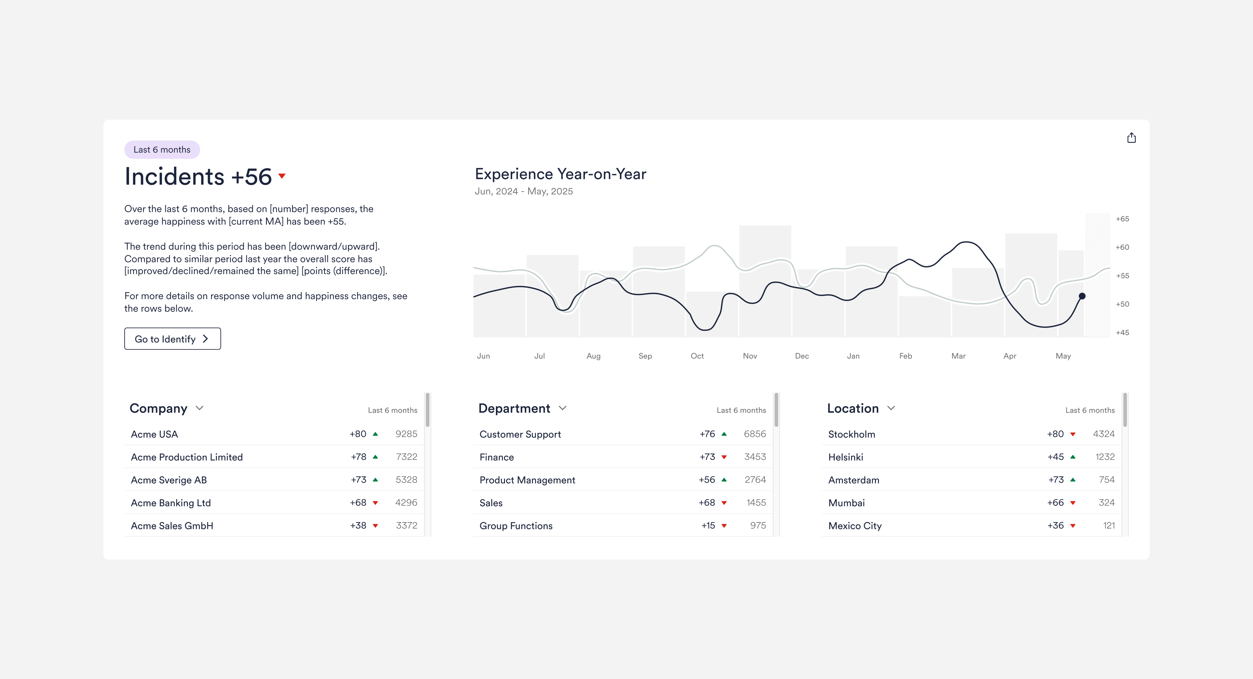
A consistent six-month overview brings together Happiness, trends, response volumes, and key organizational dimensions, giving users an immediate picture of performance.
When something requires attention, users can move directly into deeper analysis while keeping the same context and timeframe.
To keep that context intact, drill-downs into Experience, Identify and Feedback preserve the same six-month window. We also removed manual dashboard filters so the overview stays focused and easy to read.
From overall scores to the reasons behind them
Knowing whether an experience is good or bad isn't enough. Users need to understand what is contributing to it.
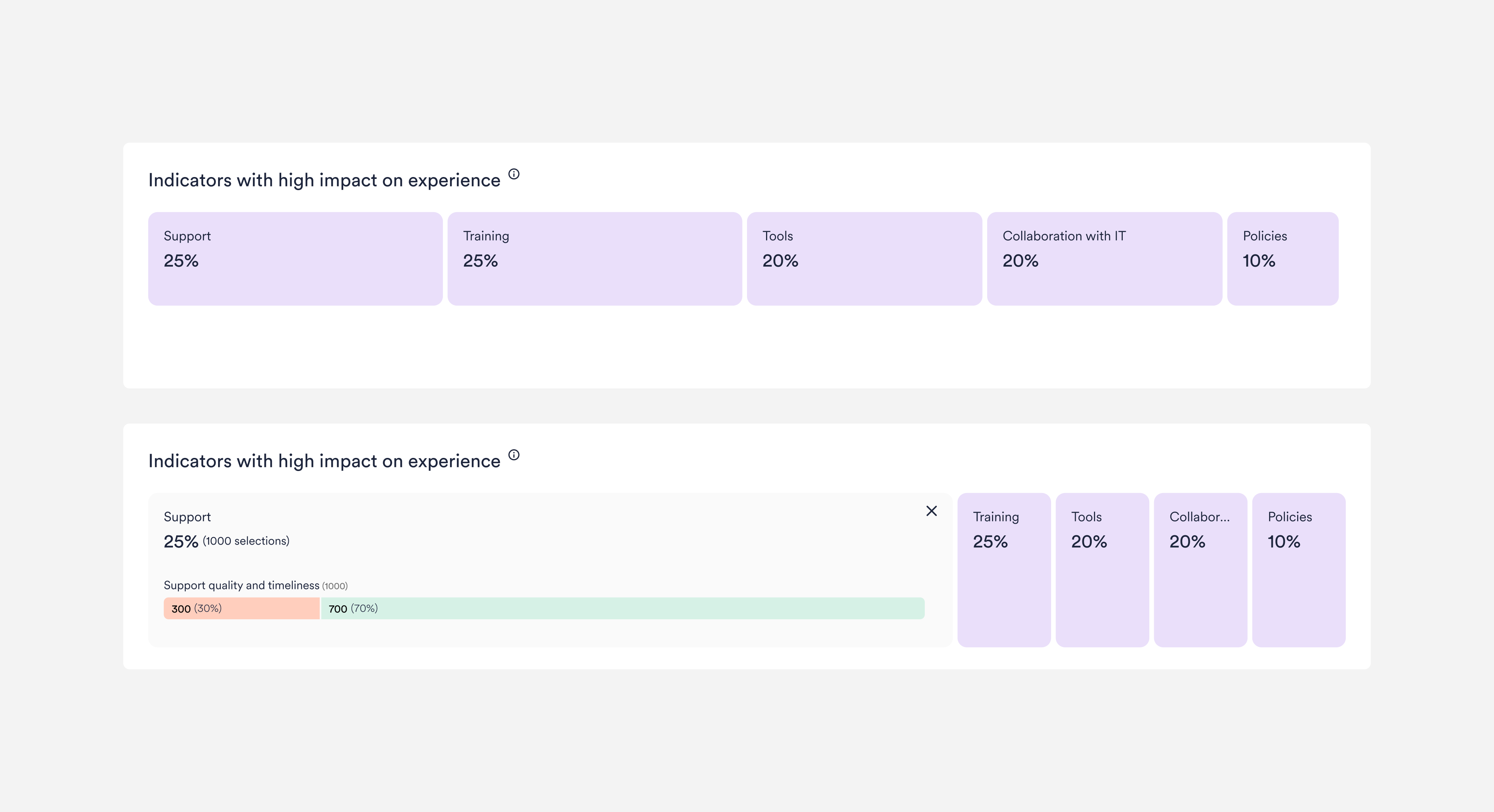
Experience Drivers group related employee responses into meaningful areas and use visual hierarchy to show which topics represent the largest share of selected experience indicators.
Users can expand each driver to reveal the individual indicators behind it and understand where experiences are positive or need improvement.
Design principle: Reveal complexity progressively.
Each driver's width reflects its share of responses, expanded indicators separate positive from neutral and negative experiences, and benchmark comparisons highlight where an organization differs from the global average.
Using AI to surface what employees are really saying
Quantitative data shows what is happening. Open-text feedback often reveals why.
But manually interpreting hundreds or thousands of comments makes recurring problems difficult to identify.
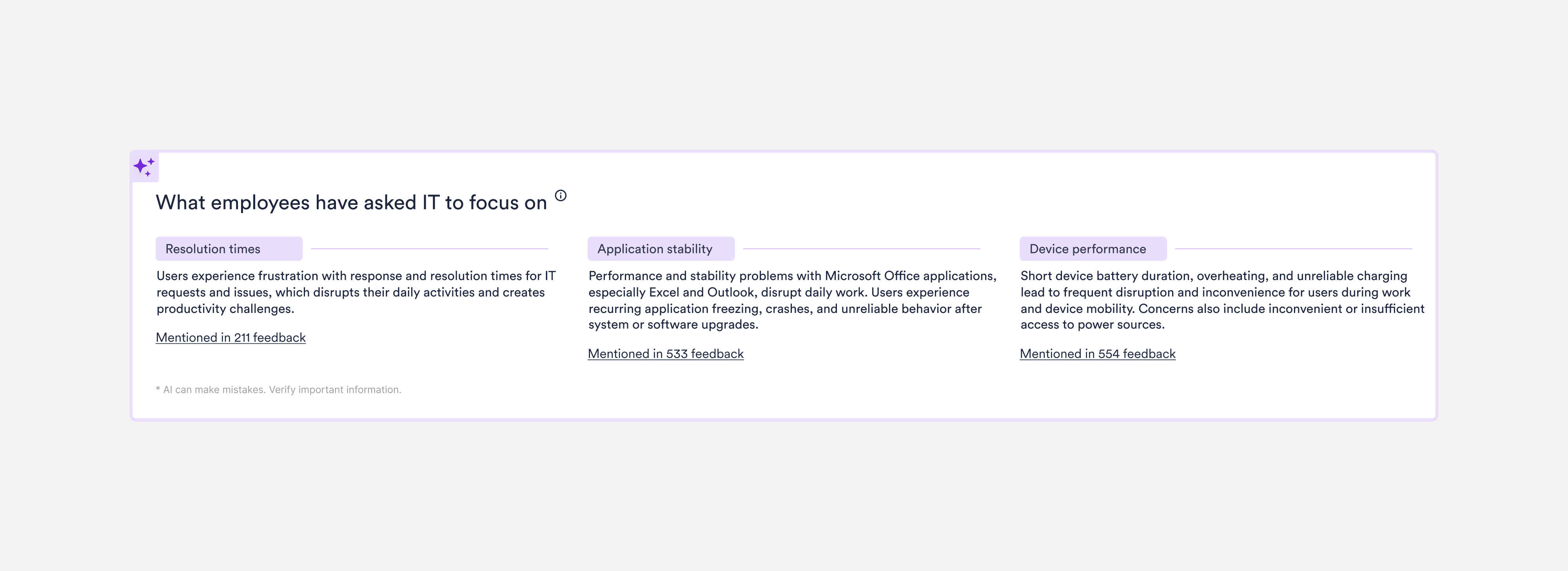
Focus Topics use AI to classify recent employee feedback into recurring themes and surface the three most prominent topics directly on the dashboard.
Users can understand what employees repeatedly ask IT to improve, then access the underlying comments when they need more context.
Design principle: Use AI to reduce complexity, not add another layer of it.
Behind the scenes, the AI classifies six months of feedback against 10–30 themes per measurement area and surfaces only the top three, keeping the dashboard short while the full detail stays one click away.
Looking beyond averages to reveal meaningful differences
Overall experience scores can hide important differences between employees.
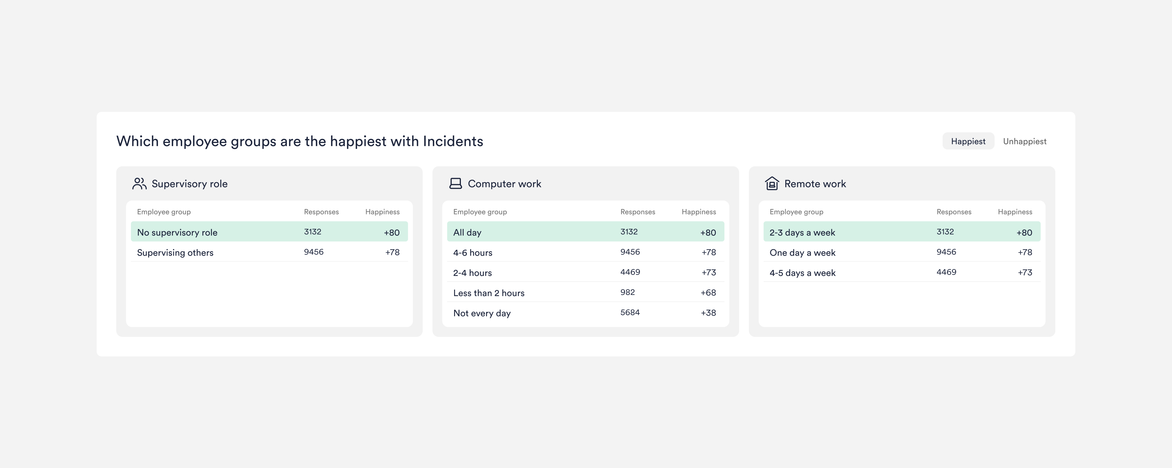
Employee Analytics adds context by connecting feedback with anonymous information about employees' roles, responsibilities, and ways of working.
This allows users to identify which employee groups are happier, which are struggling, and where improvements could be targeted instead of applying the same solution to everyone.
Design principle: Turn aggregate data into relevant human context.
Feedback is linked to employee attributes while preserving anonymity, so organizations can compare groups by role, responsibilities and ways of working, both today and over time.
Outcome and learnings
The renewed Dashboard created a clearer starting point for experience management at HappySignals. It rolled out to every customer without major friction, and users now spend 4x more time on the dashboard than they did on the previous version.
By bringing performance, Experience Drivers, AI-analyzed feedback, and employee context into a clearer hierarchy, users can understand where they stand, identify what deserves attention, and move naturally into deeper analysis.
Key Learnings:
Clarity comes from prioritization
More data doesn't necessarily create more understanding. Deciding what users need to see first was fundamental.
Progressive disclosure makes complexity manageable
A strong overview gives users confidence while keeping deeper analysis available when they need it.
AI works best when it reduces effort
Focus Topics turns large volumes of qualitative feedback into clear areas of focus without removing access to the underlying data.